
Let’s dive into visualizing business data and how it helps you to understand business performance. But first, let’s understand what data visualization actually is.
What is Data Visualization?
Data Visualization is nothing new, but the way we use data and visualize it has changed over the years. We all grew up looking at visualized data in one way or another. Weather patterns and weekly forecasts on the news are great examples. So it’s essential to consider why they present it to us this way.
So why do they present weather data this way?
Visualization makes data easier to understand, more engaging, and accessible at all ages or levels of comprehension. Data Visualization is the practice of presenting data pictorially or graphically, and formulating it into a concise, easy-to-understand format. Thinking back to the weather, they use animations of forecasted weather such as a glowing sun or clouds with rain and the expected high and low temps, along with colors to signify these temperatures. This makes comprehending what the weather will be like elementary without needing any formal training or understanding.
What are the Benefits of Visualizing Business Data?
Just as the weather is easy to understand at all levels, so should your business data, metrics, or analytics. Of course, different levels of work call for varying levels of understanding, but making data visual democratizes understanding. By visualizing data, everyone is able to understand and comprehend it in their own way. With more eyes on a problem, you can assess and draw conclusions faster, and make better decisions together.
Sure your analysts can look at a daunting spreadsheet and come to conclusions on your data, but they aren’t looking at vanilla documents; they’re using tools and shortcuts to visualize data in their own right. So, should your analysts be the only ones who can understand your business’s performance at a high level?
Absolutely not!
Many businesses’ biggest mistake is thinking that access to analytics and data is a privilege only to those formally trained to understand and analyze it. For example, suppose your social media manager isn’t qualified or skillful enough to operate in spreadsheets. In this case, you’re at a severe disadvantage because they now need someone else to help analyze performance data, unable to make essential on-the-spot decisions.
Now suppose you arm your social media manager with one or more tools that visualize data automatically without them having to lift a finger. Of course, this would directly benefit the work they’re doing day-to-day, but it also provides you direct access to the same insights without waiting for the monthly or quarterly report. Your result is greater oversight while empowering your team to make effective and more efficient decisions.
How can you Visualize your Business’s Data?
With hundreds of different tools and apps, finding the right solution for your needs is imperative. Fortunately, dozens of free tools are available to move you in the right direction.
PCMag has a great breakdown of some top-performing free tools: [10 Free Data Visualization Tools]
If you’re looking to get serious about your data and are searching for a scalable, effective, and easy-to-use solution for data visualization, Databox is the way to go.
What is Databox?
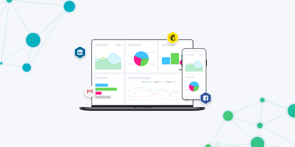
Databox is a business intelligence and data visualization platform built to make accessing your data straightforward. A top-rated option on G2, Databox is our go-to solution for visualizing data at CarbonWeb internally and for our clients.
The heart and soul of Databox are dashboards. You can create reports from hundreds of different data sources. The platform is easy to use; with a drag and drop editor and one-click connections to data, you can bring multiple data sources together in minutes.
Creating your dashboards has never been easier, with numerous templates for measuring hundreds of different KPIs and performance goals. In addition, all dashboards are embeddable, allowing you to bring customized reports into your current work environment.
Whether you’re looking to track your marketing campaigns, website performance, CRM metrics, or anything else, Databox is an effective solution. CarbonWeb offers dashboards for all of our services to ensure transparency and improve your ability to track performance.
